Simplifying commuter experience for Mumbai's local and metro trains.
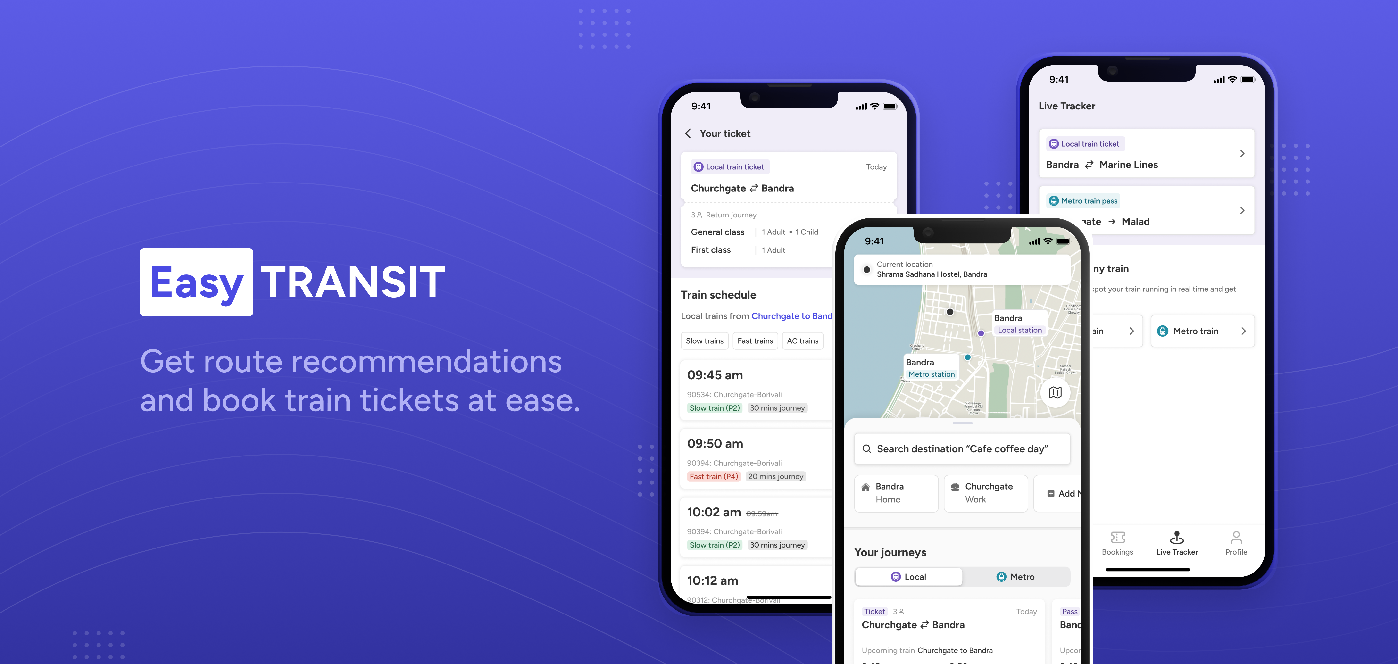
EasyTransit is a self-directed case study designing a journey-planning and ticketing app for Mumbai's local and metro trains, a network of 700+ trains moving over 85 lakh commuters a day across four lines and a growing metro system.
Commuters were stitching together Google Maps, M-Indicator, and UTS just to answer one question: how do I get there? I designed a single flow that starts from a destination, not a station name, and does the comparing for you.
What's the problem?
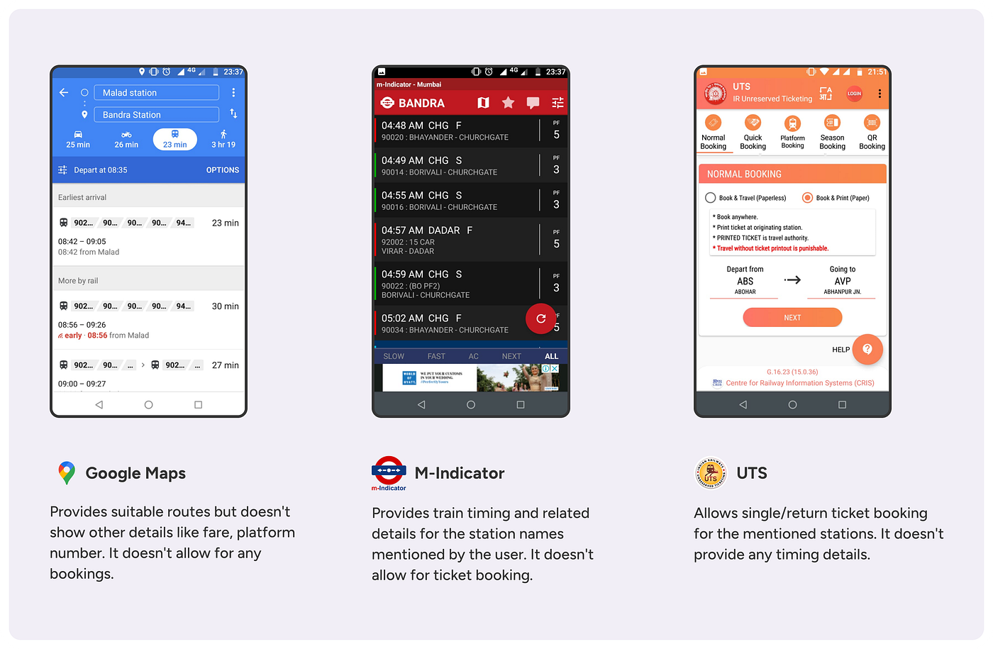
Say you want to meet a friend at a cafe in Dadar. You don't know it by station name, you know it by what's near it. So first you check Google Maps to find the place, then figure out which local or metro station is actually closest, then check train schedules on M-Indicator, then check fares on M-Indicator or UTS, then compare all of it in your head, then finally open UTS to actually buy the ticket.
Every one of those apps assumes you already know your boarding and destination station names. Real trips rarely start that way.
Three separate apps, three separate jobs, one trip. Nothing connects them.
Why it mattered?
This isn't a rare edge case, it's the default case. Two kinds of commuters hit this wall in different ways. Regulars traveling a known route mostly just want to know if their usual train is on time and how much longer their pass has left. But anyone going somewhere new, meeting friends, running an errand, exploring a new part of the city, has to rebuild the same five-app research process from scratch, every single time.
Multiply that by 85 lakh daily commuters on a network with four local lines, multiple terminus stations, and a metro system that's actively expanding, and "just check three apps" stops being a minor annoyance and becomes a real tax on every unfamiliar trip in the city.
Challenges & how I solved them
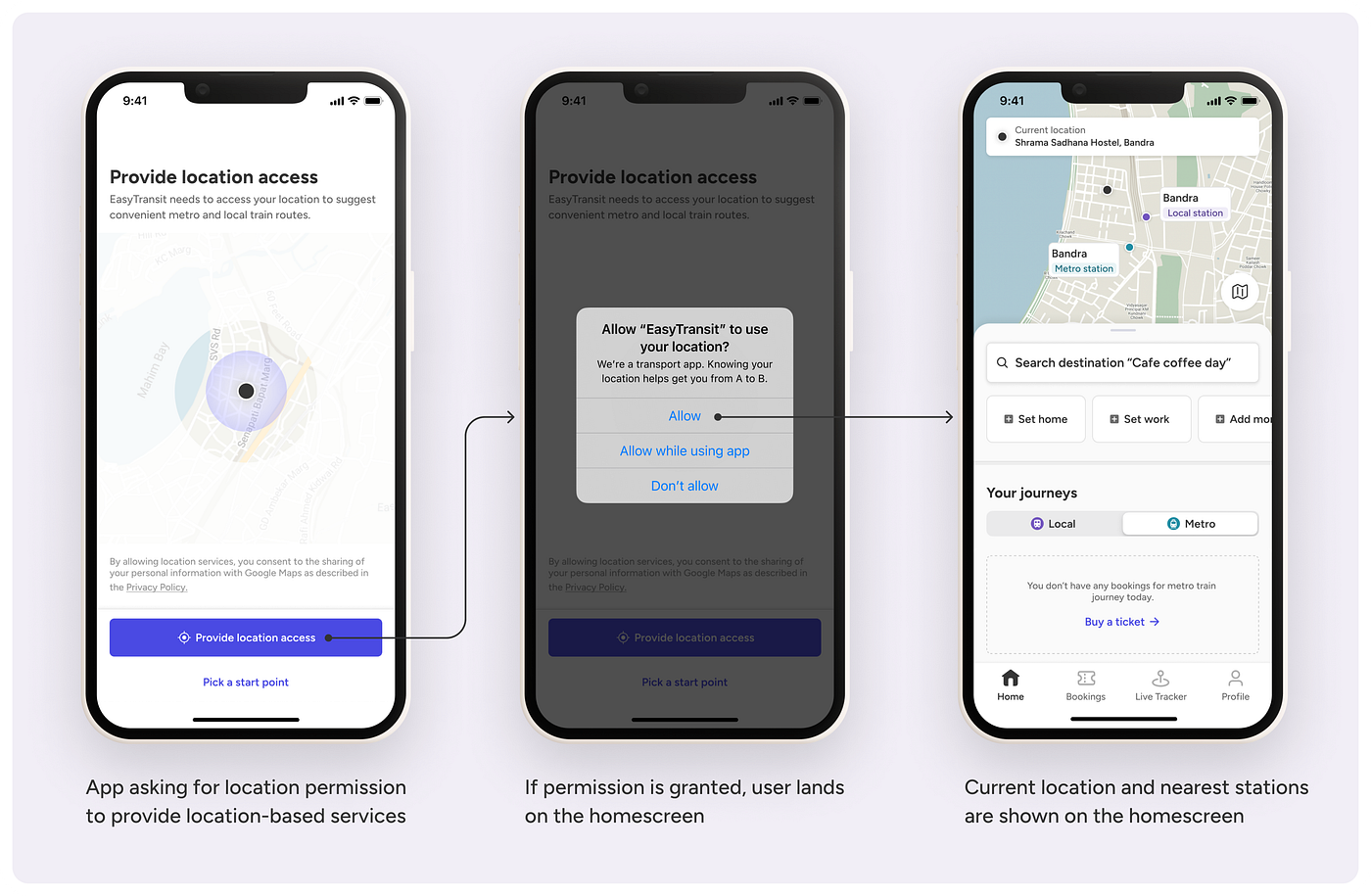
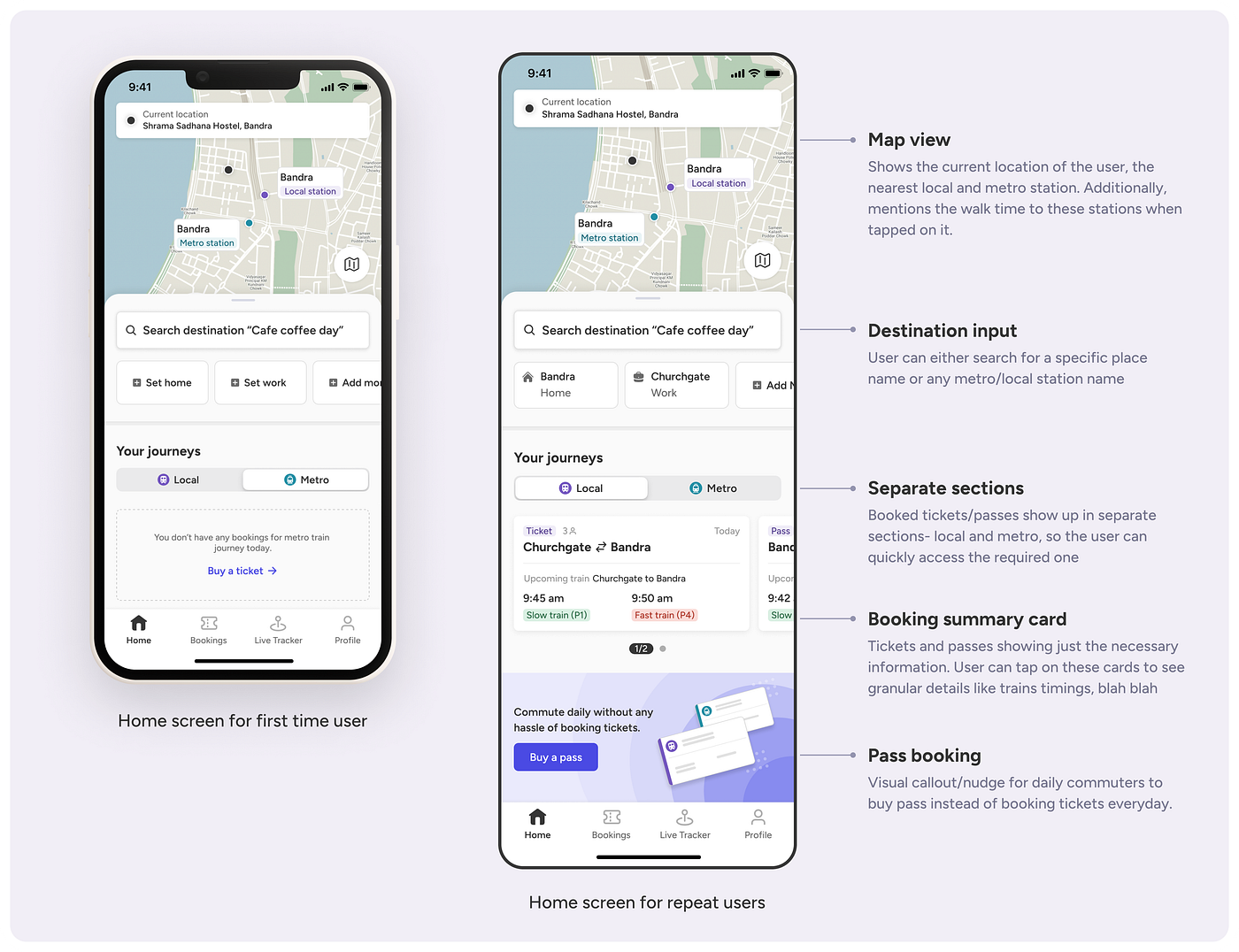
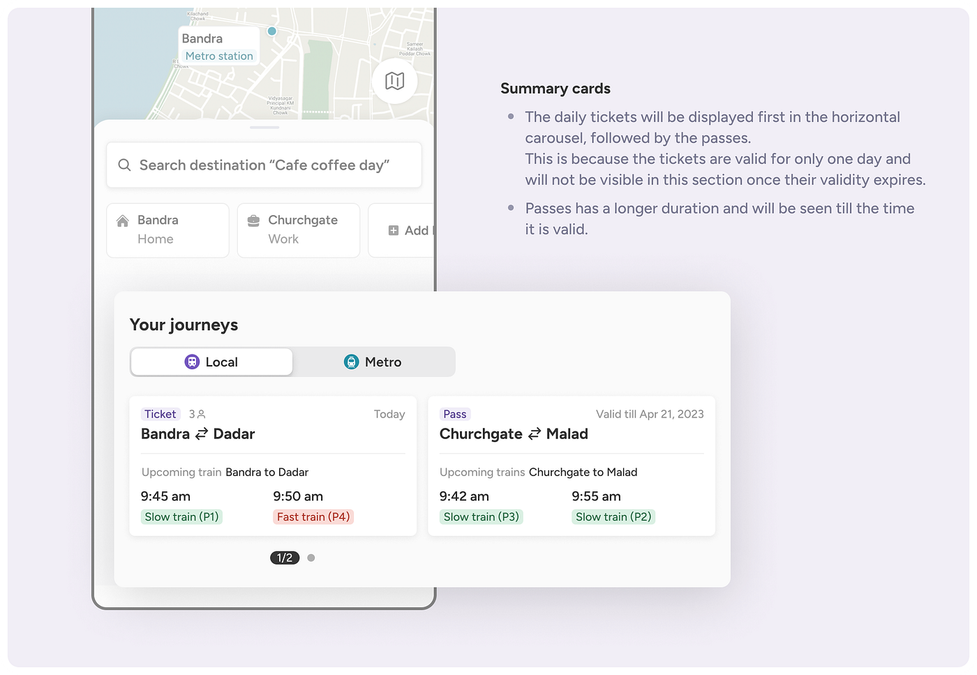
Two very different commuters, one app. A daily commuter and a first-time visitor to a neighborhood need almost opposite things from the same screen, status and pass tracking for one, full route discovery for the other. I designed the home screen around three clear zones instead of forcing one generic layout to serve both.
People don't think in station names. Every existing app required an exact station name to even start. I moved the entry point to a destination search, a cafe, a landmark, anything, and pushed the station-matching logic behind the scenes instead of onto the user.
Tickets and passes needed different mental models. Booking a one-off ticket and renewing a pass you already understand are not the same task. I split the flows so a regular commuter's pass renewal stays short, while a new route still gets the full comparison experience.
The solution
The core flow starts with a single input: where are you going. From there, EasyTransit matches nearby stations, compares local versus metro, and surfaces the practical tradeoffs, time, cost, walking distance, so the decision that used to take three apps and a mental spreadsheet takes one screen.
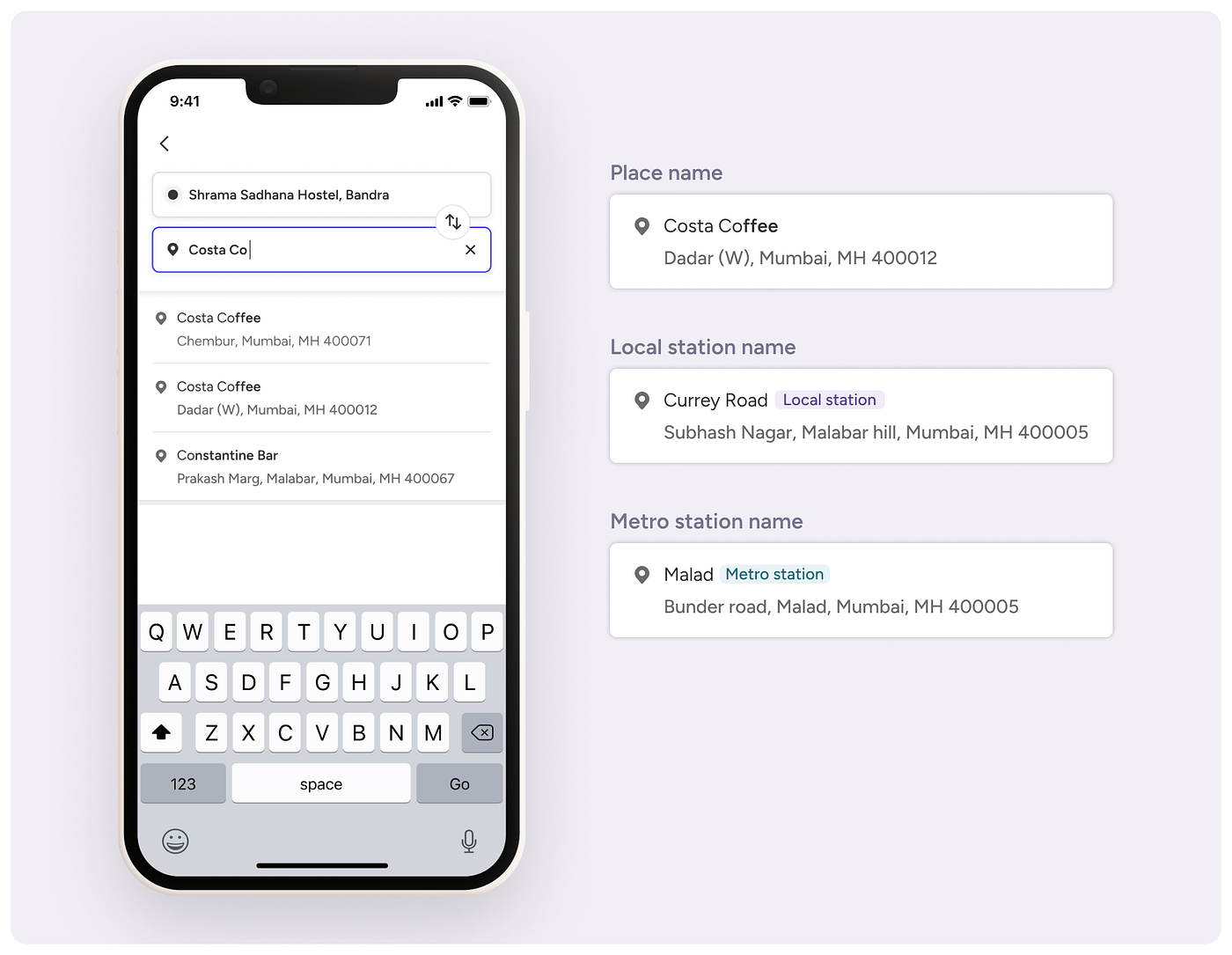
Search by destination, not station name. Local and metro results resolve behind the scenes.
Typing a place name instead of a station name, and the app resolving it in real time.
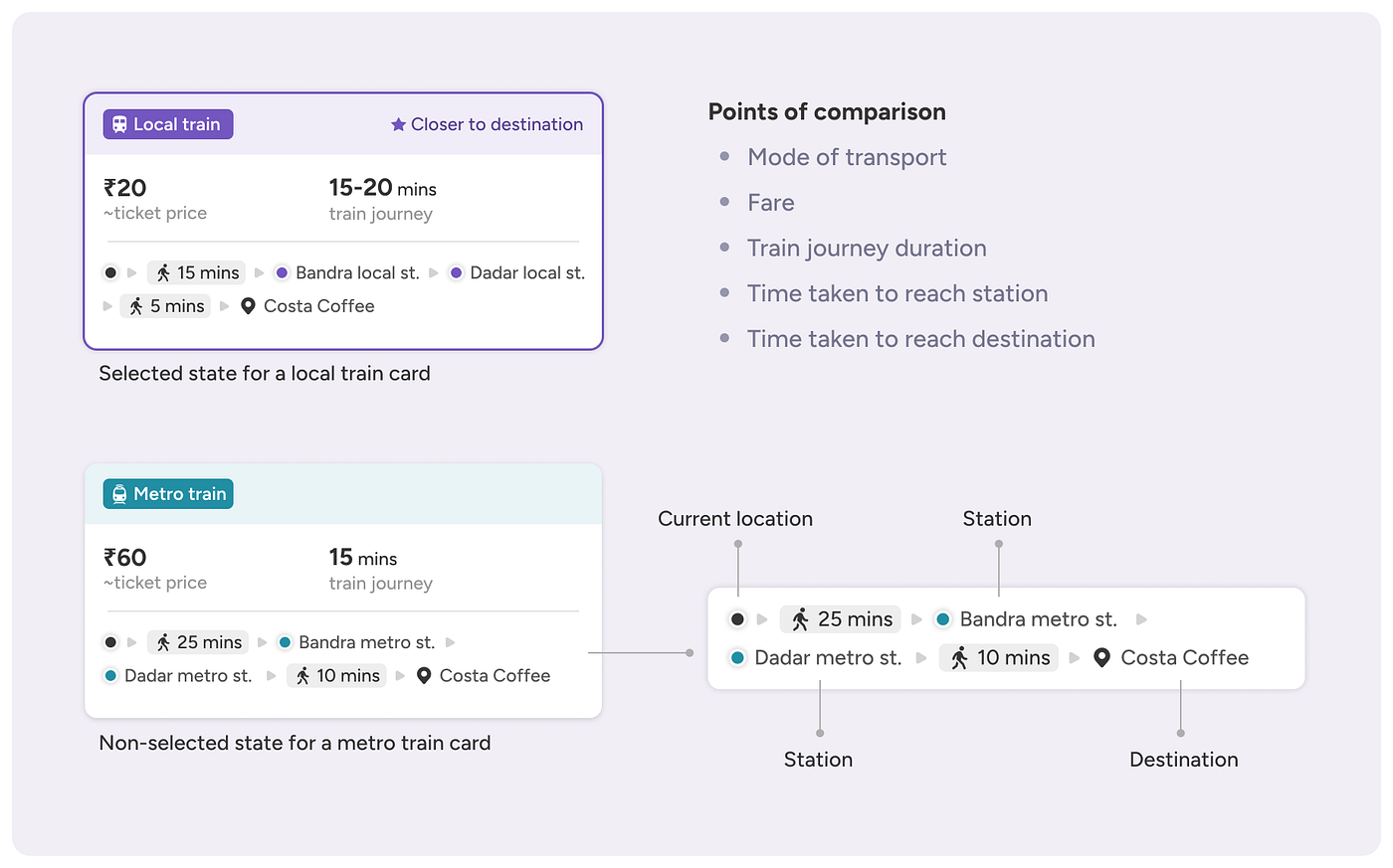
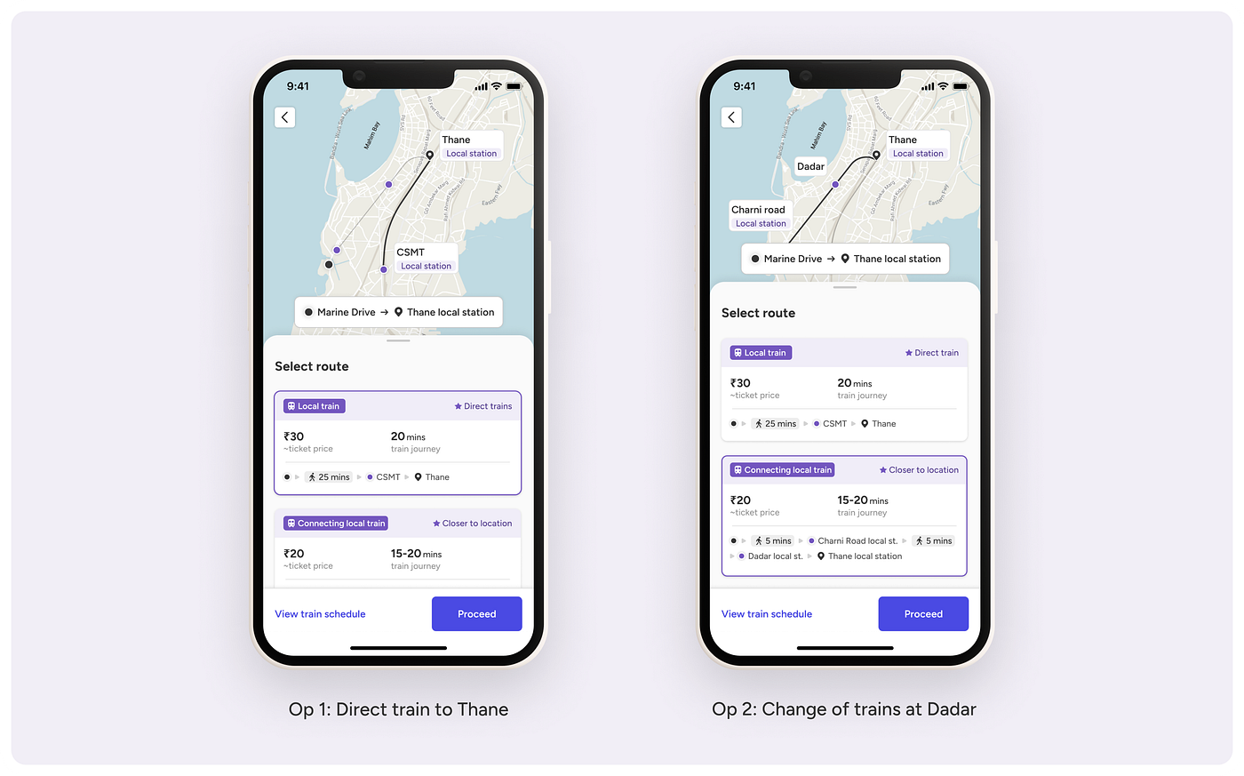
Every route option carries the same comparable data: fare, duration, and walk time to the station.
Even a same-line decision, like a direct train versus one with a change, gets laid out plainly instead of buried in a schedule.
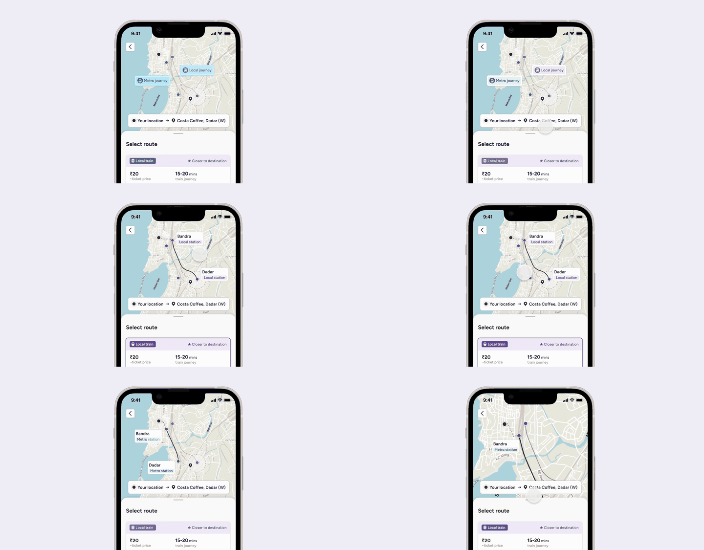
Moving between route options and seeing each one plotted on the map.
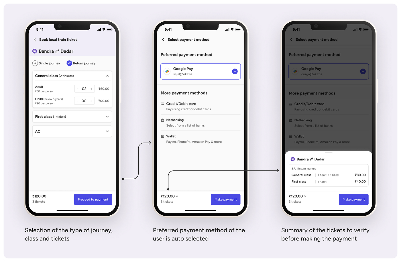
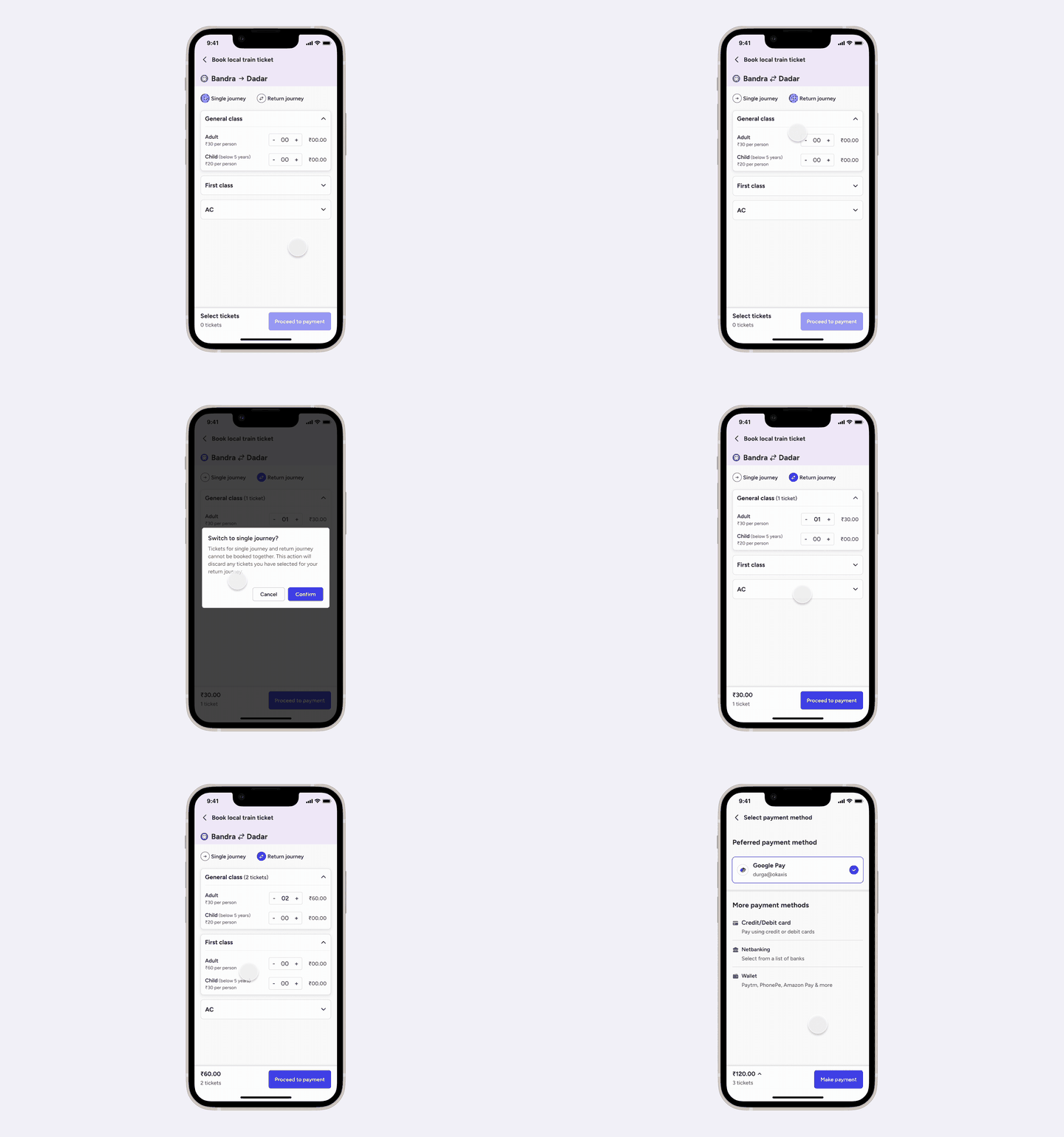
Journey type, payment, and a verifiable summary before the user commits to paying.
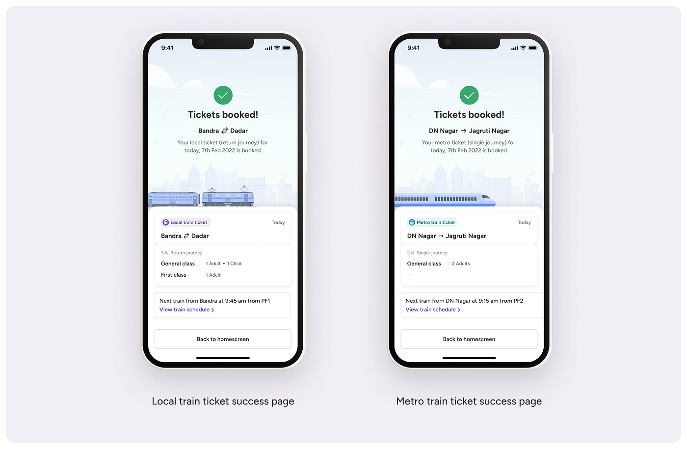
The full booking flow, start to finish, in one continuous pass.
Designing for trust, not just booking
Booking a ticket solves half the problem. Mumbai's local trains run with frequent, often last-minute delays, and the deeper anxiety for commuters isn't "how do I book," it's "will I make it." That's the part a hiring manager glancing at a booking-app case study would expect me to skip, so it's the part I designed for deliberately.
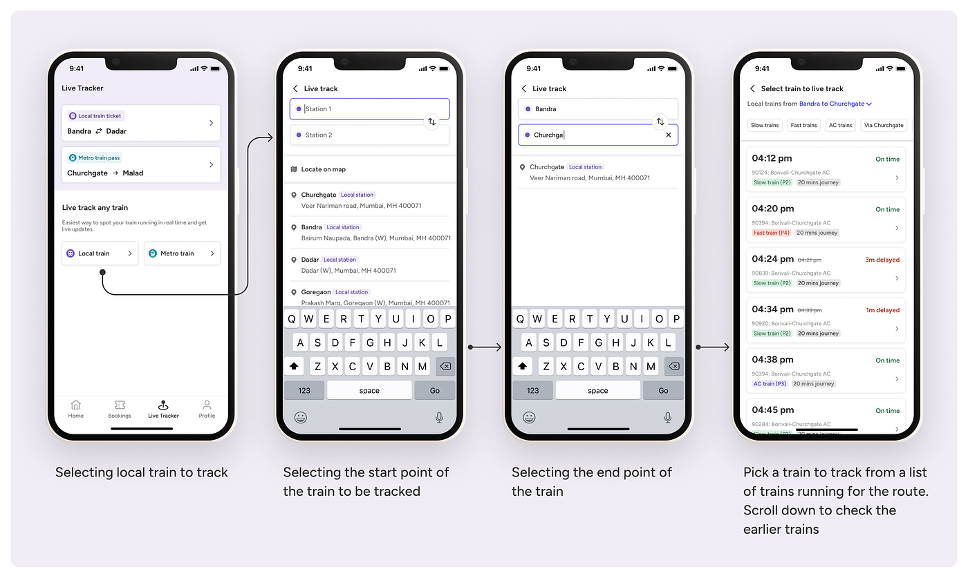
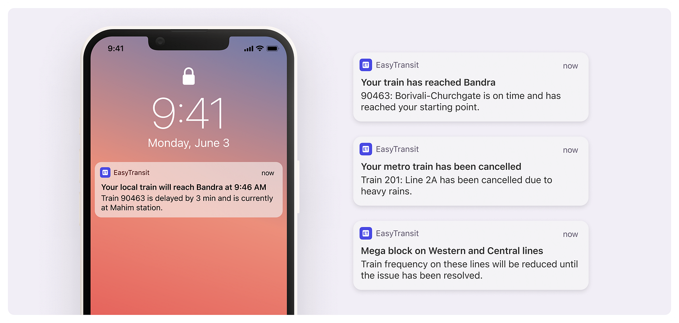
Live tracking surfaces real-time status, platform number, and delay updates directly on a commuter's booked journeys, and lets them set recurring notifications for the specific days they actually travel, rather than a generic daily alert nobody wants.
Tracking isn't limited to booked journeys, commuters can look up and track any train, any station.
A delay you find out about at the platform is a problem. A delay you find out about before you leave the house isn't.
Outcomes
This was a self-directed case study, not a shipped product, so there's no usage data to report here. What follows is what the process actually produced.
A destination-first flow validated against real routes. Every flow was stress-tested against real commuter scenarios I mapped myself, including multi-station transfers and same-line alternate routes, not just the happy path.
A reusable design system. Typography, color, shadows, buttons, an icon library, and componentized cards, built to keep 30+ screens consistent instead of one-off.
A sharper research instinct. The strongest idea in the app, comparing routes by real tradeoffs instead of just showing a map, only surfaced after mapping my own commute frustrations against actual competitor apps, not from a brief.